In this article, we’ll explore how color perception shapes flavor experiences, from the brain science behind it, to cultural variations across the globe, and how this knowledge can power smarter innovation in industries like hookah, beverages, and confections. Whether you’re developing a new flavor line or rethinking your packaging, this is the insight that brings science and creativity together.
Let’s dive into the world where color becomes taste, and design becomes an invisible ingredient.
The Science Behind Taste and Color Perception
How the Brain Connects Color and Flavor
Before we even taste anything, our brain is already making predictions. If you see a pink drink, you might expect strawberry or raspberry. A golden brown might suggest caramel, coffee, or toasted tobacco. These assumptions aren’t random, they’re built from experience, memory, and culture.
Our brains create shortcuts to make sense of the world quickly. This is especially true with food and flavor. Color becomes a cue that helps us “guess” what something will taste like before we actually try it and impact on our taste perception. This expectation can actually change the way we experience the flavor itself, sometimes even overriding what our taste buds are telling us.
So, when a color doesn’t match the taste, it causes a small mental “glitch.” We might feel confused, disappointed, or just less satisfied. That’s why in the flavor and product development world, color is not just decoration, it’s part of the experience.
Cross-Modal Perception: How Sight Influences Taste
What we’re talking about here is called cross-modal perception. It’s the idea that our senses don’t operate in silos, they constantly interact. In this case, sight and taste are deeply intertwined.
Here’s a quick example: Give someone two drinks that taste the same, but color one red and the other green. Ask them which one is sweeter. Most will say the red one, even though the actual taste is identical. That’s the power of cross-modal perception.
It’s not just color either. Shape, texture, and even sound can impact flavor perception. But color is often the strongest influencer. That’s why professional flavorists, chefs, and product developers use visual cues strategically to support or even enhance the flavor story.
The Role of the Senses in Flavor Experience

Flavor isn’t just about taste buds. In fact, what we call “flavor” is a multisensory illusion that sometimes color can effect on it. Our tongue plays a part, but the full experience involves:
- Sight: Sets the expectation before tasting begins.
- Smell: Provides depth and complexity, most flavor is actually aroma.
- Taste: Detects basic profiles, sweet, salty, sour, bitter, umami.
- Touch: Think of the creamy texture of yogurt vs. the fizz of soda.
- Sound: Believe it or not, crunchiness or the pop of a bottle can alter how we perceive freshness or satisfaction.
All of these senses are processed together to create one cohesive experience. Colors, as the first input, often anchors the brain’s entire interpretation of what’s coming next and shows how color shapes the perception of the taste.
Neurological Responses to Color Stimuli in Food and Beverages
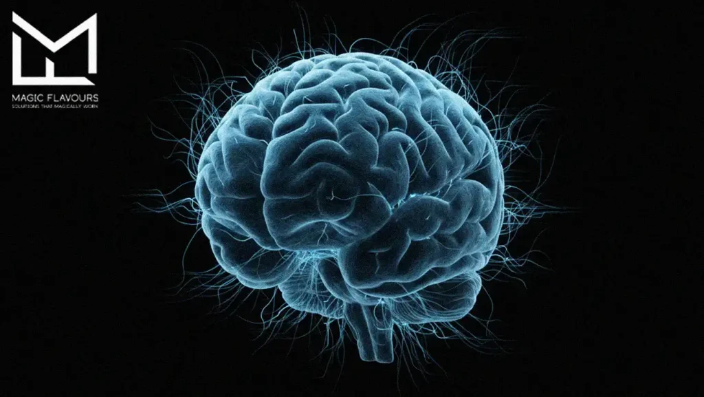
On a neurological level, color stimulates areas of the brain connected to both emotion and memory. That’s why a certain shade of red might make you feel nostalgic, or why some colors spark cravings.
Studies using fMRI (functional brain imaging) show that color triggers activation in the orbitofrontal cortex, a region tied to reward and decision-making. This means that just looking at a product can start the process of evaluating how rewarding it might be, even before you smell or taste it.
For brands and flavor developers, this is powerful. Choosing the right colors for a flavor isn’t just a branding choice. it’s a neuro-sensory decision that can impact how people perceive, enjoy, and remember the product and color taste perception.
Color Associations in Taste
Why Red Is Often Linked to Sweetness or Spice
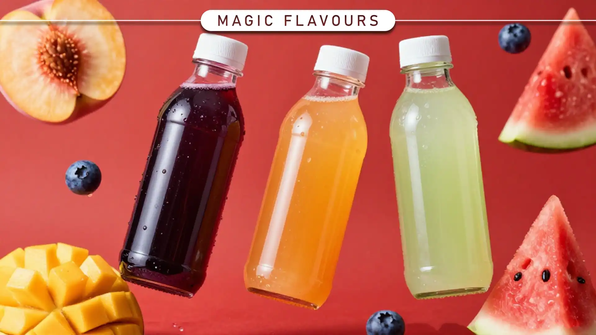
Red is a powerful color in the world of taste. It’s bold, attention-grabbing, and emotionally charged, and when it comes to flavor, our brains tend to link red with two extremes: sweet or spicy.
On one hand, red evokes familiar sweet flavors like strawberry, cherry, raspberry, or even watermelon. These are comforting, fruity, and often associated with childhood treats. On the other hand, red can also signal heat, think chili peppers, cinnamon, or hot spices. It’s a dual identity that works incredibly well in flavor development, especially when you want to either create excitement or a sense of indulgence.
In the hookah or beverage world, for example, a bright red flavor might promise either a juicy berry blend or a spicy twist. It all depends on the context and how the product is positioned, but either way, red gets attention fast.
How Blue Suggests Mint, Berry, or Coolness
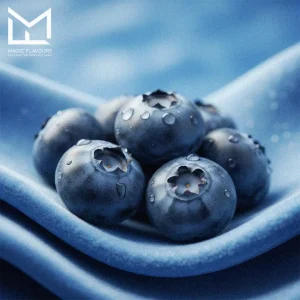
Blue is a bit of a wildcard. It’s not common in natural foods, so our brains don’t always have strong taste associations, but that’s exactly what gives it power.
In many cases, blue suggests cool, clean, and refreshing experiences. That’s why it’s often used for mint, menthol, or icy flavors. It’s also strongly linked to blueberry or “blue raspberry,” even though those flavors don’t actually look blue in nature. We’ve just been conditioned by candy, drinks, and flavored tobaccos to associate that bright blue with tangy-sweet, refreshing profiles.
Blue also feels modern, techy, or premium, so it’s often used in cooling blends, energy flavors, or futuristic concepts where freshness or clarity is part of the story.
Yellow = Citrus, Freshness, or Sourness
Yellow is instantly uplifting. It’s the color of sunshine, lemons, and anything that feels light and bright. In flavor terms, yellow almost always points toward citrus, zest, and freshness.
Lemon, lime, pineapple, grapefruit, all these tangy, vibrant flavors are tied to yellow. And because citrus is often sharp or sour, we tend to mentally associate yellow with a punch of acidity or sparkle.
This makes yellow great for flavor concepts that are meant to energize or awaken the senses, like fresh lemon-mint hookah, citrus sodas, or zesty candies. It works well when you want a flavor to feel clean, juicy, or mood-boosting.
Brown and Earth Tones = Chocolate, Coffee, Tobacco
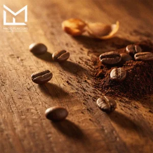
Earthy colors like brown, amber, and deep tan immediately signal depth, warmth, and richness. These tones are almost always tied to comforting, grounded flavors, like chocolate, coffee, caramel, nuts, and of course… tobacco.
When people see brown or golden-brown hues, they expect something roasted, smoked, or aged. These colors carry emotional weight, nostalgia, indulgence, or even sophistication. In the shisha or cigar world, for example, darker tones are used to signal quality, strength, and heritage.
If you’re working on any product that needs to feel luxurious, deep, or mature, earthy tones are your best friend.